NBA City Jersey Rankings.
The NBA has released their new NBA City Jerseys and boy, they are something. I was reading an ESPN column during last night’s Oh Hi Oh Guys…Podcast. What took me aback was how basic his taste was. So I instead opted to do my own grading. In typical site format, we’re going by the Rules of Five like we do for everything. Cus we’re sick.
When doing an alternate jersey, there are several rules to follow. Firstly, it should be different from anything you have in the rotation. It needs to be unique among your own gear.
It should also not feel too copy-catish league ride. Doing what another team does is weak. Be original.
The colors should make sense for your franchise. While you can go off the map on occasion, remember what keeps your team unique.
K.I.S.S. – Keep it simple, stupid! You jersey designs shouldn’t look like an art major’s first show painting. No one cares about your messed up child hood, we want clean!
And finally, the cool factor. This is as subjective as it gets. And that’s why Imma’ do it.
Each category is going to be graded out of five, with five being the most and well you know the rest, you’re not dumb. Zero’s are possible. Only because of Boston.
First up;
Atlanta Hawks
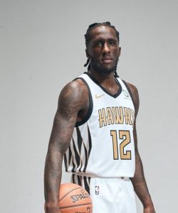
Team Originality: 4
League Uniqueness: 4
Colors: 1
Design: 3
Cool Factor:1
Rating: 13 out of 25 (52%)
Synopsis: The gold colors don’t make these jerseys pop, and the side designs don’t really pop. It’s not bad but it’s not great. Very forgettable.
Boston Celtics
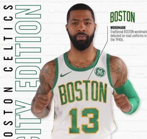
Team Originality: 0
League Uniqueness: 0
Colors: 0
Design: 0
Cool Factor: 0
Rating: 0 out of 25 (0%)
Synopsis: Did you even try Boston? This looks like your regular jerseys but with a gold lettering and number barrier. That’s fucking stupid.
Brooklyn Nets
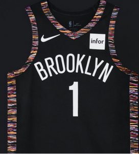
Team Originality: 3
League Uniqueness: 3
Colors: 3
Design: 1
Cool Factor: 2
Rating: 12 out of 25 (48%)
Synopsis: This was based off of Biggie Small’s unique sweaters and while that’s nice, it’s simply outdated and ugly. It really only has nostalgia going for it and nostalgia is dangerous.
Charlotte Hornets
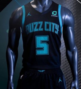
Team Originality: 3
League Uniqueness: 2
Colors: 3
Design: 4
Cool Factor: 3
Rating: 15 out of 25 (60%)
Synopsis: I like the design and layout but the black on teal is nothing that dynamic, as most teams now have a solid black jersey. These are supposed to be shock and awesome, not meh and eh…
Chicago Bulls
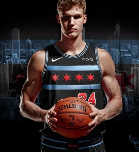
Team Originality: 5
League Uniqueness: 5
Colors: 5
Design: 5
Cool Factor: 5
Rating: 25 out of 25 (100%)
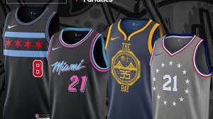
Synopsis: These are legit. From the Chicago city flag as the logo, the stark light blue, the lowered and shifted numbering. These are fantastic.
Cleveland Cavaliers
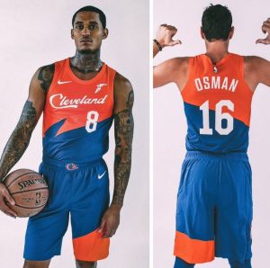
Team Originality: 5
League Uniqueness: 5
Colors: 5
Design: 5
Cool Factor:5
Rating: 25 out of 25 (100%)
Synopsis: Yeah, I’m a homer but I love these jerseys because of that. They tap into the 90’s iconic blue and black jerseys which are beloved in Cleveland, and use the 80’s color scheme. A perfect blending of two generations for a new generation.
Dallas Mavericks
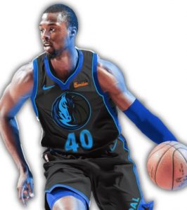
Team Originality: 3
League Uniqueness: 1
Colors: 1
Design: 1
Cool Factor: 1
Rating: 7 out of 25 (28%)
Synopsis: Its a dark blue logo, with what, a dark grey back ground? A blue border helps but these are not inspired at all.
Denver Nuggets
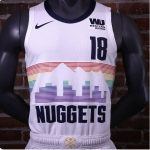
Team Originality: 3
League Uniqueness: 4
Colors: 5
Design: 3
Cool Factor: 2
Rating: 17 out of 25 (68%)
Synopsis: Alex Swisher really enjoyed this design but I remember when this logo was used and I hated it then and hate it now. I like the use of the city skyline but the rainbow is too washed out and the printer-esc layering is old and tacky. The lettering and unspoiled white really do add something though.
Detroit Pistons
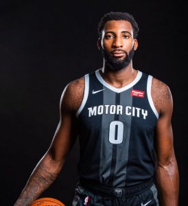
Team Originality: 5
League Uniqueness: 4
Colors: 3
Design: 4
Cool Factor: 3
Rating: 19 out of 25 (76%)
Synopsis: I really like this. The colors invoke the Uconn Huskies, one of my favorite teams so obviously I’m preferential to that, and I love the street center line being showcased down the middle. It invokes what Detroit was built on; the auto industry.
Golden State Warriors
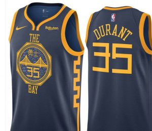
Team Originality: 2
League Uniqueness: 1
Colors: 3
Design: 3
Cool Factor: 2
Rating: 11 out of 25 (44%)
Synopsis: I hate these. So much. Firstly it rips off of Houston’s use of the Chinese lettering, which made sense as Yao Ming helped make Houston super popular in China. This feels stolen. The colors are a shade deeper than their standard jerseys. Tacky and follows a trend.
Houston Rockets
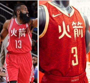
Team Originality: 0
League Uniqueness: 3
Colors: 3
Design: 2
Cool Factor: 2
Rating: 10 out of 25 (40%)
Synopsis: Not only are these jerseys conflicting with Golden States current design, but they also just changed the white to gold in last years design. You literally ripped off your own design.
Indiana Pacers
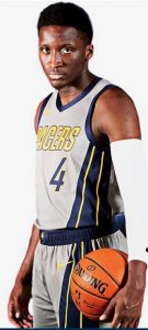
Team Originality: 5
League Uniqueness: 5
Colors: 4
Design: 5
Cool Factor: 4
Rating: 23 out of 25 (92%)
Synopsis: While they have a similar tone to Detroit, it’s actually quiet different. Indiana is home to the Indy 500, which is represented in the race track stripes running down the side of the jerseys. Similar to Detroit but captures their own history perfectly. A stark color for the base may of sold this better.
Los Angeles Clippers
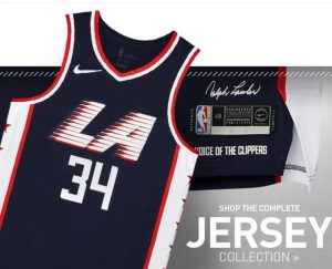
Team Originality: 5
League Uniqueness: 5
Colors: 5
Design: 5
Cool Factor: 5
Rating: 25 out of 25 (100%)
Synopsis: I love these. It taps in the Dream Team era Team USA Olympic jerseys while adding it’s own flair to the design. A master class in design.
Los Angeles Lakers
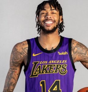
Team Originality: 4
League Uniqueness: 4
Colors: 3
Design: 3
Cool Factor: 2
Rating: 16 out of 25 (64%)
Synopsis I’m surprised I like these as much as I did. I like the stripes, it helps make these feel unique, and the black, gold and purple just feel lavish on your eyes. Purple isn’t that much off from their base, and the lettering could be more different.
Team Originality: 4
League Uniqueness: 3
Colors: 3
Design: 4
Cool Factor: 4
Rating: 18 out of 25 (72%)
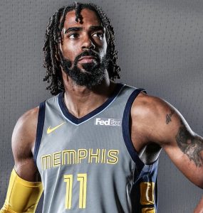
Synopsis: The grey bothers me, but I love the shades of blue, the yellow and the lettering. It feels very Tron-like but in a modern way. It’s sharp and stands out from their closet other looks.
Miami Heat
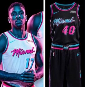
Team Originality: 1
League Uniqueness: 5
Colors: 5
Design: 5
Cool Factor: 3
Rating: 19 out of 25 (76%)
Synopsis: I do like these a lot. The white on the left are last seasons, while this seasons are on the right. I like the black and neon better than the white but the facts are simple; this is the same design and same color scheme, just swap it out for a black background and rotate the layout of the colors.
Milwaukee Bucks
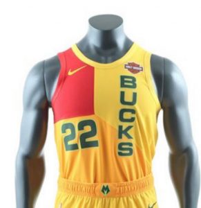
Team Originality: 5
League Uniqueness: 5
Colors: 1
Design: 1
Cool Factor: 0
Rating: 12 out of 25 (48%)
Synopsis: Well….no other jersey they own, or seen in the league will look like this…So…kudos. But the design is crappy, the colors make me want to vomit and the horizontal lettering makes this look like a kindergartner made it. It’s supposed to pay homage to their Mecca Era from the late 70’s to the 80’s but god…there had to be a better way of doing that.
Minnesota Timberwolves
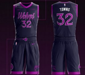
Team Originality: 5
League Uniqueness: 4
Colors: 4
Design: 5
Cool Factor: 4
Rating: 22 out of 25 (88%)
Synopsis: Part of the issue with these is that it evokes too much of a similar vibe with Miami’s Vice designs. However, these Prince (the he musician) designed jerseys do stand out. While no purple in their colors, they tapped into Purple Rain to really fuel the design and it works.
New Orleans Pelicans
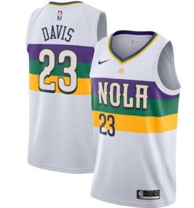
Team Originality: 1
League Uniqueness: 2
Colors: 3
Design: 0
Cool Factor: 0
Rating: 5 out of 25 (20%)
Synopsis: You may wonder why I have this so low? Because it feels like a jolted ex hooking up with someone new who looks just like you. The New Orleans Pelicans are borrowing from the old New Orleans Jazz designs and colors. The Pelicans, unlike say the Cleveland Browns or the Charlotte Hornets, don’t share linage with the Jazz. So this is a blatant rip off. The Brown’s can’t wear purple and black and refer to their “past in Baltimore”. Neither can the Pelicans.
New York Knicks
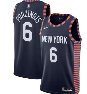
Team Originality: 2
League Uniqueness: 3
Colors: 3
Design: 2
Cool Factor: 1
Rating: 11 out of 25 (44%)
Synopsis: I like the navy blue and the lettering but the border is so often used these days for their specialty jerseys it seems that it feels uninspired.
Oklahoma City Thunder
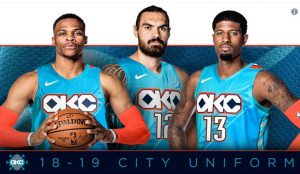
Team Originality: 4
League Uniqueness: 3
Colors: 3
Design: 4
Cool Factor: 2
Rating: 16 out of 25 (64%)
Synopsis: I like the diamond in the lettering, and the pattern on the jersey proper, it feels almost ancient in it’s design. The colors though aren’t that unique, and the design feels limited.
Orlando Magic
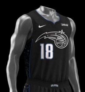
Team Originality: 1
League Uniqueness: 3
Colors: 1
Design: 1
Cool Factor: 1
Rating: 7 out of 25 (28%)
Synopsis: This looks like its in grey scale for some reason, but it might not be and that’s even worse. The constellation on the side is cool but even if it’s black and blue in it’s color choices that’ll still be so similar to so many Magic jerseys of yesteryear.
Philadelphia 76’ers
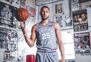
Team Originality: 4
League Uniqueness: 3
Colors: 3
Design: 5
Cool Factor: 2
Rating: 17 out of 25 (68%)
Synopsis: These are supposed to be Rocky inspired, yet I don’t see it. The stars around the numbers though sell this for me. Everyone is doing grey and grey isn’t that different than their usual white home jerseys. Not that cool, but damn, those stars.
Team Originality: 1
League Uniqueness: 3
Colors: 4
Design: 1
Cool Factor: 1
Rating: 10 out of 25 (40%)
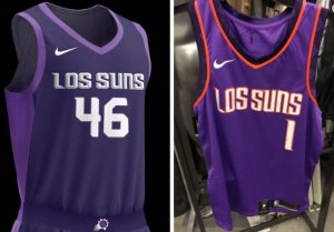
Synopsis: The left is last years jerseys, I’d give that an 18 probably? I like the spacing, but not a fan of the purple on purple. This years (right) look like the Suns’ jerseys from the 90’s but with Los Suns (The Suns in Spanish) looking more like LOSSUNS, which is nothing. Ugly, outdated, and uninspired.
Portland Trailblazers
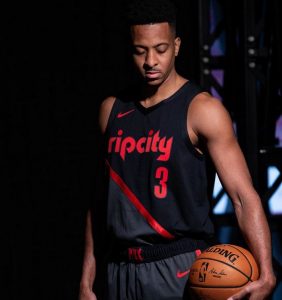
Team Originality: 3
League Uniqueness: 2
Colors: 3
Design: 3
Cool Factor: 3
Rating: 14 out of 25 (56%)
Synopsis: Pretty average. Portland has a lot of black and red jerseys. The Rip City isn’t that new. The only thing unique is the grey that shred through half the jersey and fuck grey. What’s with everyone and grey this year?
Sacramento Kings
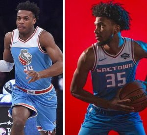
Team Originality: 1
League Uniqueness: 3
Colors: 2
Design: 2
Cool Factor: 0
Rating: 8 out of 25 (32%)
Synopsis: The left is last years, the right is this. They changed their name to SacTown which no one wanted, the lion is gone, the colors remind you of a 1960s washer machine ad, and blah. Just all the blah.
San Antonio Spurs
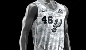
Team Originality: 0
League Uniqueness: 5
Colors: 3
Design: 3
Cool Factor: 2
Rating: 13 out of 25 (52%)
Synopsis: This is like their third or fourth camouflage inspired jersey. I appreciate the support of the troops but as far as uniqueness goes, a zero is being courteous. The others who copied their own previous design are only on their 2nd. So this is far more worthy of a zero. Just ask Boston.
Toronto Raptors
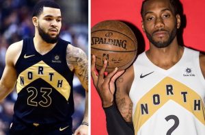
Team Originality: 1
League Uniqueness: 4
Colors: 3
Design: 3
Cool Factor: 1
Rating: 13 out of 25 (48%)
Synopsis: Ugh, they’re the same jerseys as before, just with white (right and now) instead of black (left and last year). Come one, people! We can do better…
Utah Jazz (2017)
Team Originality: 4
League Uniqueness: 4
Colors: 3
Design: 4
Cool Factor: 3
Rating: 18 out of 25 (72%)
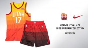
Synopsis: They don’t have any new jerseys this year, electing to go with last years which are nice. I’m not sure of why they went with the colors they did but maybe too bold? That’s just me.
Washington Wizards
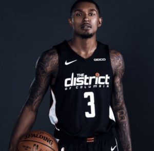
Team Originality: 5
League Uniqueness: 5
Colors: 4
Design: 5
Cool Factor: 4
Rating: 23 out of 25 (92%)
Synopsis: I like the fact they called themselves the District. Unlike say ‘Rip City’, this is actually in their city’s name. They are in Washington D.C. or Washington, District of Columbia. The black and white are a nice contrast from their red, white and blue, and I love that white side on the jersey. Just a nice, bold look.

