While I usually do top ten’s, this list won’t be in any particular order, and will be the first in a series. First it’s stables, then wrestlers, then companies. After that, it’ll be a trip back to stable logos as I continue to explore and loo into other stable logos. So here’s the first eleven logos and why I like them so much.
Suzuki Gun – I’d put this one higher but honestly, I have no idea what it means. For that reason, I can’t in good conscious put it high. 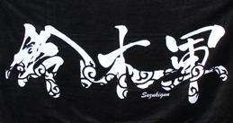 The logo is chaotic, which attributes to their leader’s mentality. It also appears to have wind swirling within the white of the lettering, which again pays respect to the old saying of Suzuki, ‘Be the Wind’. it’s simple, but truly beautiful. I’m not sure what the core lettering says, possible just ‘Suzuki Gun’, but I can’t be sure. the black and white contrast though is a bit overused, but when in conjunction with something as beautiful as placing an emphasis on wind, it can be overlooked and forgiven.
Bullet Club – The Bullet Club logo is pretty new but also pretty iconic. 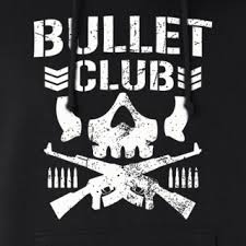 The top logo is worn, worn out and the symbolism is pretty spot on, almost too spot on. Sharp bullets, and semi-auto rifles adorn the bottom, and the bullets add more to the name sake than people realize. It’s the military stripes though that really drive home that this isn’t a group of men, but the militia that took over NJPW. With Cody Rhodes retiring it, it’s going to be interesting to see what they replace it with.
nWo: WolfPac – The Wolfpac logo is the same as the traditional black and white New World Order logo,  however the alternate logo really was impressive. While the group was made up of top stars trying to be “cool”, the logo was more in line with what fans wanted out of the group; rage. Rage at the nWo and their wicked ways, rage at WCW for not being enough to qwell the up rising, and a wicked new look that should of done more to put over new stars than was allowed. The wolf-logo, much like its living counterpart, serves as a warning to not venture so far off the beaten path. However, the team was never as wicked or gnarly as their logo. A cat eating catnip would of been more accurate a representation of this group.
New World Order – The New World Order logo’s entire layout is the perfect visual representation to the anti-establishment stable. 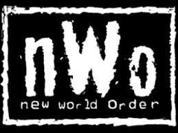 The WCW logo was streamline. The lines were straight, and formed a simple, yet powerful logo. The nWo logo served to counter everything the WCW logo was about. It wasn’t as organized, using lower and capital letters for the lettering. An uneven border helps establish the feeling that this group cares less about the logo and more about the mission at hand. The similar stylized lettering falls in line with the nWo’s desire to “tag” wrestlers after beatdowns. They weren’t worried about things like straight lines or something mundane, they wanted to leave an impact. So the lettering needed to be jagged to match the spray-paint. While simple in it’s layout, the logo did a perfect job letting fans know what they were about to see.
De-Generation X – This is the one logo that I can honestly feels nothing like the group it represented. The Wolfpac logo sure, was a bit of a departure. However, Kevin Nash and Scott Hall both dawned the names of the Lone Wolf at some point, and Konnan was known as K-Dawg, 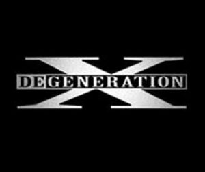 so at least they used the concept to some degree. D-X was more known for their over the top antics rather than their militaristic design. Sure, they had the DX army but let’s be real, that gimmick never lived up to the groups outrageous style. Maybe more so in 2000, but by then the logo had been around for three years. The solid lines make you think of something with order, and respect. The black background helps the X standout, almost mimicking the idea of a famous rebel, Malcolm X. The change in color in ‘DeGeneration’ helps allude the feeling of something unique and cool. While this is my favorite logo of the group, the new one that came round in 2006 was far more accurate to the group’s feel for this time, but didn’t match at all what they were about in 2006.
Main Event Mafia – A first for TNA (but not the last). The logo is pretty awesome actually. The group was originally five former world champions, and five future hall of famer’s, so it’s not surprising that the logo works so well. 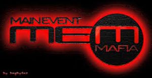 The logo is black lettering, with a red hue, on a field of black. The red embraces the black logo, clings to it, almost like blood clings to a wound. The focus of the logo is pulling you to the final ‘M’. That ‘M’ is for Mafia ,which during the course of the stable’s run was the prime focus of the group; family first. So when you see that the team name, the ‘mafia’ of the logo is the focus of the group, it automatically tells you all you need to know; this is a real tight-nit group.
Evolution – The stable was a modernized take on the Four Horsemen, so that’s adorned all across the logo of Evolution’s logo. 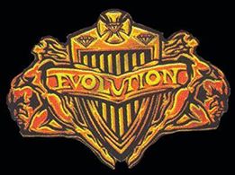 The grill of an expensive car feels like it’s jetting out at you, almost as if its crossing the finish line of a race. The ‘Evolution’ banner that’s draped across the grill brings the whole package together that these men had won the evolutionary finish line. The women, attached to the side of the logo, again hammers home the point these men are at the apex. The ladies love them, because they’re so great. What better way to establish this fact than properly putting it out there for all to see.
Four Horsemen – While not my favorite iteration of the logo, that one was just used for the DVD of the group, so this one is a close a second.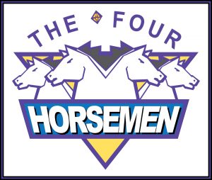 The horses emerge from the center of the image, as if running in unison. Something this group did more so than Evolution. The logo was simple, yet elegant, and it’s sharp edges help remind one of their classic saying, “Diamonds are forever, and so are the Horsemen.” The lack of focus on anyone figure also helps put over the idea of the Horsemen, as they constantly practiced the idea that they were all in it for one another, despite Flair often being at the top of the card. It’s hard not to appreciate the subtlety that made up this logo. It’s truly impressive, especially when you realize the lack of colors added to the design, instead of taking away from it.
Age of the Fall – Age of the Fall was a group in Ring of Honor led by Jimmy Jacobs and heavily featured Seth Rollins, then known as Tyler Black. 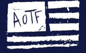 The group launched an underground type efforts on fledgling social media cites before anyone really tried. They used MySpace and blog sites to prop up their message and principals, while getting fans talking. Their symbol is actually black on a white background, but for the purpose of this article, we’re using a slightly different version. The chaotic lines, a now common troupe for wrestling logos, wasn’t all to common in the mid 00’s. So seeing a flag like this, that draws inspiration from the underground punk scene, was rare for the time period. The group was dedicated in their desire to tear down Ring of Honor from within, and instilling chaos. Their logo and flag drove home that point the minute you laid eyes on it.
The Beautiful People – This is one of my favorite stable logos. The purple is a unique treat for me, as you don’t see many heading into 2007 who used it. The color choice was great, but considering the Beautiful People was really ![]() the first major women’s group of the modern era, who actually competed, it needed something more. Hence the layout of the words. Look at the way they incorporated silhouettes into the purple. It almost looks as if they used cookie cutters of ladies, applied into the purple and pulled out the designs – leaving only the sex appeal of the shadows within the letters. The dramatic use of women in the lettering added a whole new element not just to the logo but the group as well. Even their logo demands beauty and perfection, a common re-occurrence for the stable during it’s lengthy run.
the first major women’s group of the modern era, who actually competed, it needed something more. Hence the layout of the words. Look at the way they incorporated silhouettes into the purple. It almost looks as if they used cookie cutters of ladies, applied into the purple and pulled out the designs – leaving only the sex appeal of the shadows within the letters. The dramatic use of women in the lettering added a whole new element not just to the logo but the group as well. Even their logo demands beauty and perfection, a common re-occurrence for the stable during it’s lengthy run.
Beat Down Clan – The Beat Down Clan was IMPACT Wrestlng’s attempt to answer the Bullet Club of NJPW. The group was made up of wrestlers who competed in Japan for some time and were known to be stiff and aggressive in their styles, and their logo brought that ideology to life. ![]() The group used a traditional Japanese kabuki mask as the centerpiece, drawing an almost eerie image of who these wrestlers were on the inside. The swords and brass knuckles highlight their ideals of ‘by any mean’s. The lettering and sharp lines around it, give you the impression of a wound. With an almost blood like fele to the way they drip, and run down. The lettering also draws inspiration from the world of tagging, with a spray paint style letter pattern.
The group used a traditional Japanese kabuki mask as the centerpiece, drawing an almost eerie image of who these wrestlers were on the inside. The swords and brass knuckles highlight their ideals of ‘by any mean’s. The lettering and sharp lines around it, give you the impression of a wound. With an almost blood like fele to the way they drip, and run down. The lettering also draws inspiration from the world of tagging, with a spray paint style letter pattern.